Blog Article
Announcing the new Stellar logo
Author
Stellar Development Foundation
Publishing date
Logo
Brand
As you know from our 2019 Roadmap, we’re hard at work revamping stellar.org.
A big piece of that work has been devising a new brand identity for Stellar itself. The current look has gotten us far, but Stellar’s future needs something with more design flexibility. We have big plans. Could you see a cartoon rocket ship in use at some central bank or in a press release from a national monetary authority? We couldn’t either.
We’ll soon get to our new look, but before we do, let’s take a second to say goodbye to the old one: so long, Rocketship! You’ve served us well, and we’ll remember you fondly. As you blast off on a hero’s journey to explore the universe, know that we wish you all the best. Please tell the vast, empty reaches of space all about broken payment systems back here on Earth.

Okay. Onward. To help us redefine our visual identity, we enlisted the design firm Kurppa Hosk. To start, we came up with a few guiding principles:
The new logo should be versatile.
Stellar is an open network. It serves as the backbone to all kinds of financial products and services and is home to a diverse ecosystem of projects. The logo should be use-case neutral—for example, it can’t be clearly about “remittances”. The logo should of course look good at any size: as an app icon, on coinmarketcap, on a tee shirt, on a billboard. And the logo should be at home in any context, from national media to r/stellar.
The new logo should tell some of Stellar’s story.
It should reflect the openness of the network. It should feel friendly, inclusive. And, ideally, it should nod to Stellar’s past—if the logo can’t be a cartoon rocketship, it could at least harken to Stellar’s more playful, space-exploratory days.
The new logo should work as a currency symbol.
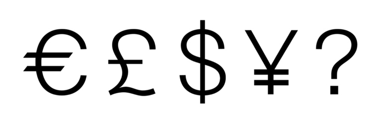
This final requirement evolved as we worked with Kurppa. On its own, our logo will represent Stellar Lumens, so it should be able to stand in for the coin. But also, in the future, when Stellar is a global monetary standard, the logo will need to work in-line, so you can type it in a sentence, like you do with $ and € and £ and ¥. The unicode symbol for “Stellar Lumens” might not yet exist, but it one day will, so the logo should come prepared.

Our initial explorations led us to a series of circles with strikes through them:

Round seems friendly and planetary — not to mention coin-like — and the strike suggests direction, action, and movement. But among the above designs there were valences of "do not enter" and "the empty set" that as an open, busy network we wanted to avoid.
So, over many iterations, we played with the negative space. And the stroke weight. And rotated the logo around so it looked a little like an “S”. And, you know, where one line is good, two lines is even better...so without further ado, we present the new Stellar logo:

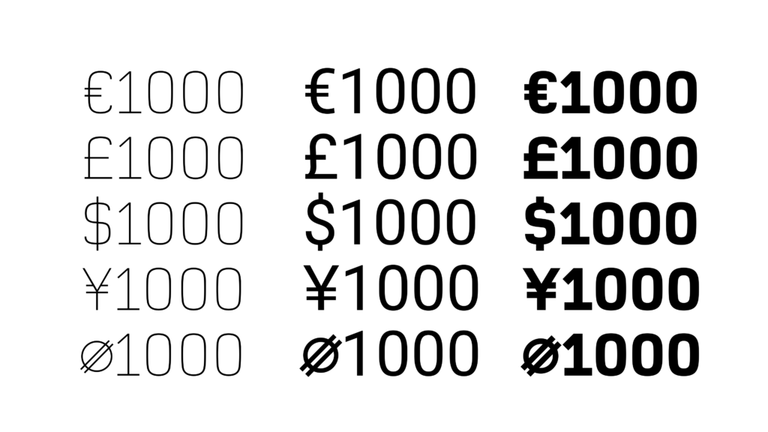
It’s got resonance with our “S”; it’s got just a hint of Saturn in there; and it can work in copy as a currency symbol like so:

While we needed to completely refresh the logo, we wanted the new Stellar wordmark to be more familiar to our long-term community. The typeface we chose is a bit sleeker and more modern, but not all that different—which will help with continuity for all the projects who’ve already built on Stellar.

Here are the mark and logo deployed across our three main use-cases. We wanted to make sure that, like nodes on the Stellar network, those variations intertwine.

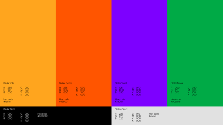
We’ve also devised a new palette for Stellar. Something warmer and less predictably “financial” than the current blue and gray.

We will launch the brand officially with the stellar.org redesign in May, and we’ll begin using the identity in new projects effective immediately. We’re very excited to be taking this first public step towards a new face for Stellar. We look forward to seeing it everywhere soon.